PictureThis Product Guide
The “PictureThis” Visual for Power BI helps you create dynamic image grids or tables that can be used as an interactive filter in your reports. With just an image url in your dataset, the PictureThis visual dynamically generates a clickable image grid or table to be used as a filter or be filtered upon. No need to download or prep loads of images and manually define tons of url actions, this visual gets you started right away. This Product Guide explains how to use all the brilliant options of the PictureThis visual when you are creating a reports containing the interactive PictureThis Image Grid. Below all the options of the “format pane” are explained. The content of the Configuration screen can differ from your version of the visual, we constantly keep improving and expanding the functionality visual which might result in new configuration options.
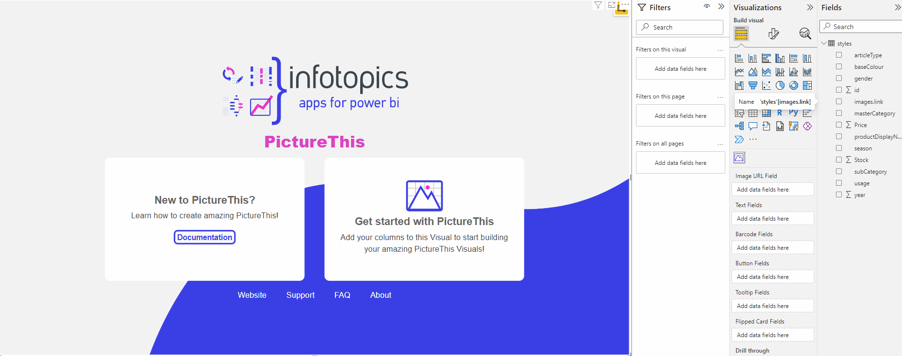
Get started with PictureThis
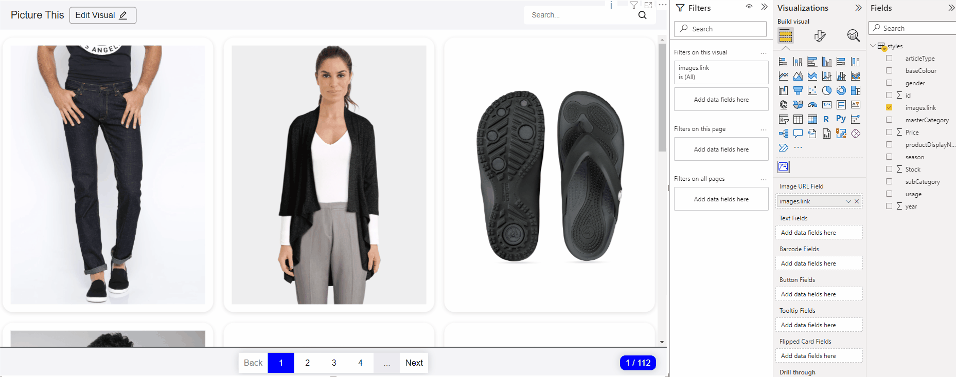
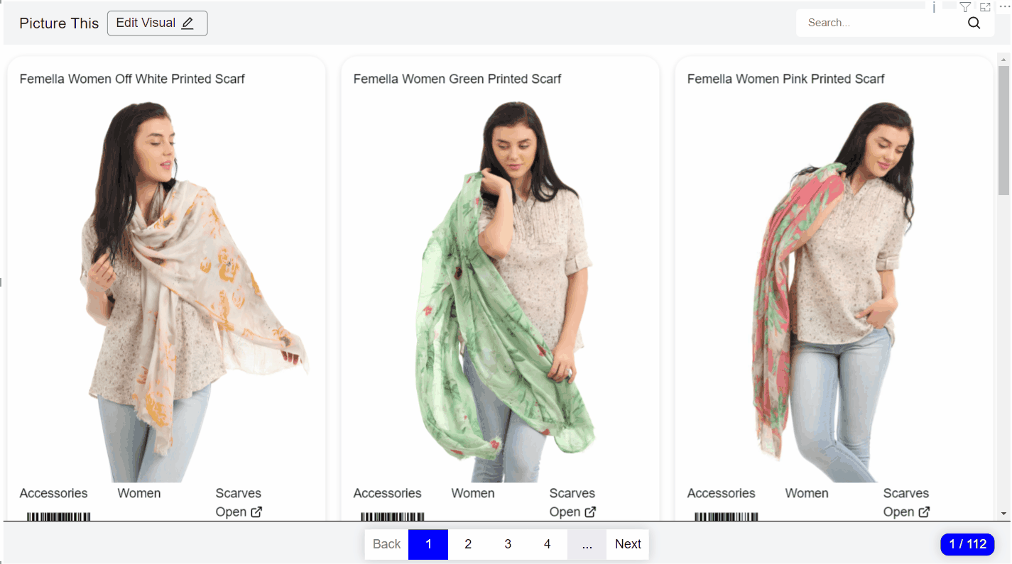
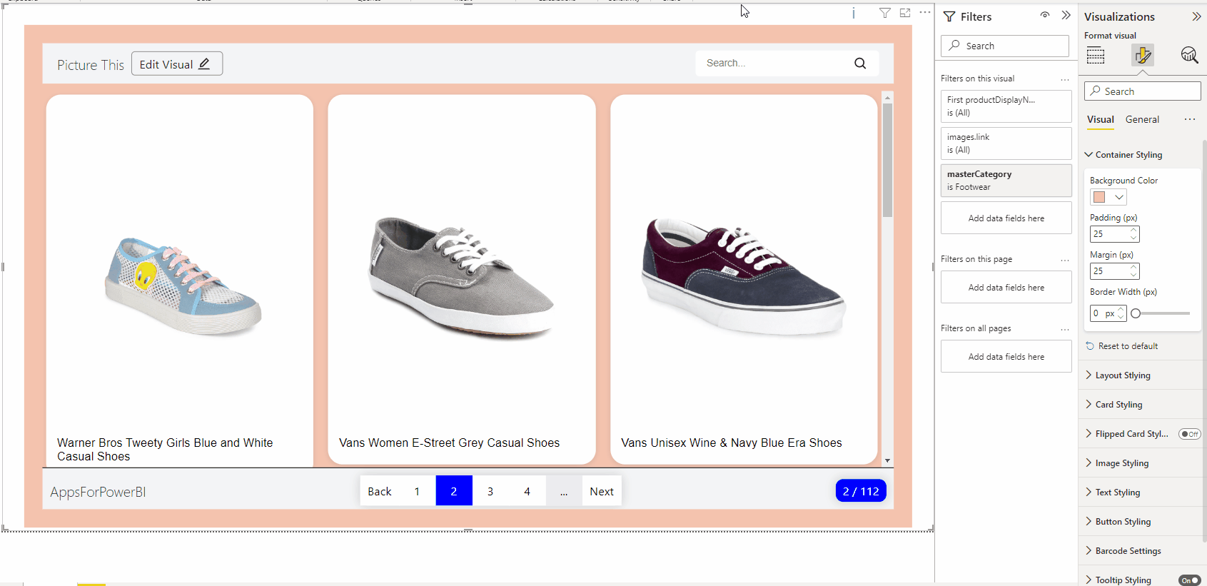
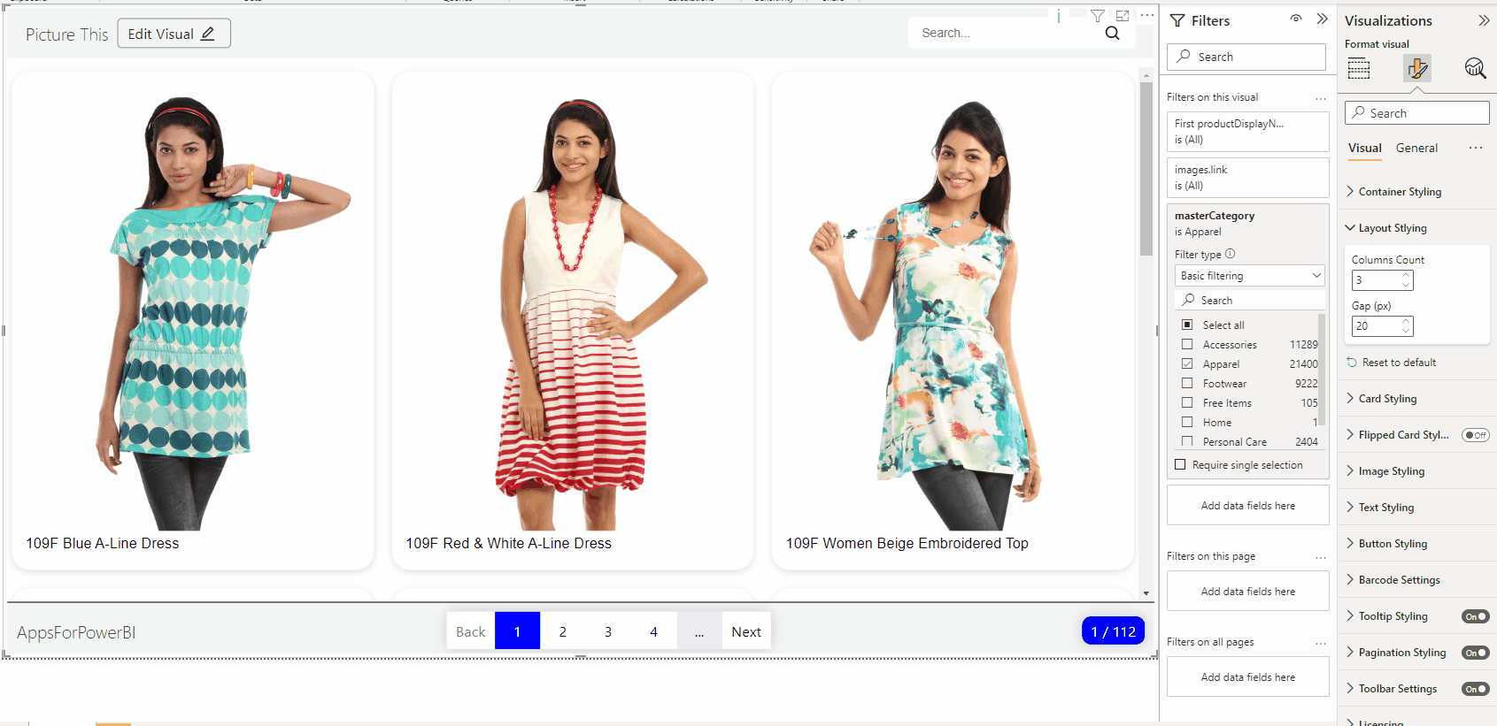
To use PictureThis, you need a dataset with a column of urls to images. Drag the column to the visual and you can start creating your own dashboard!
Without the licence, you can see a maximum of 3 pictures. Want to see more? Then buy a licence in the store, or take out a trial. These are available in the store, and see this guide on how to assign a licence to the visual.
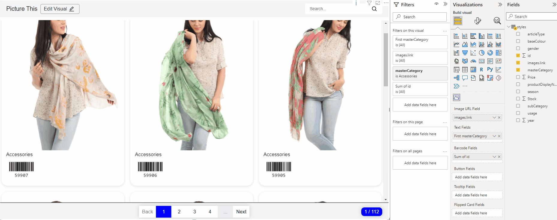
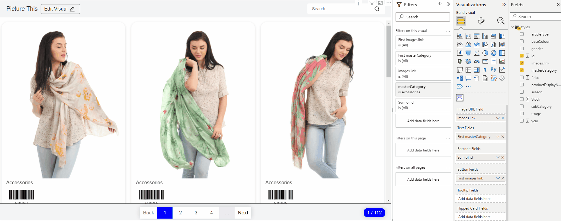
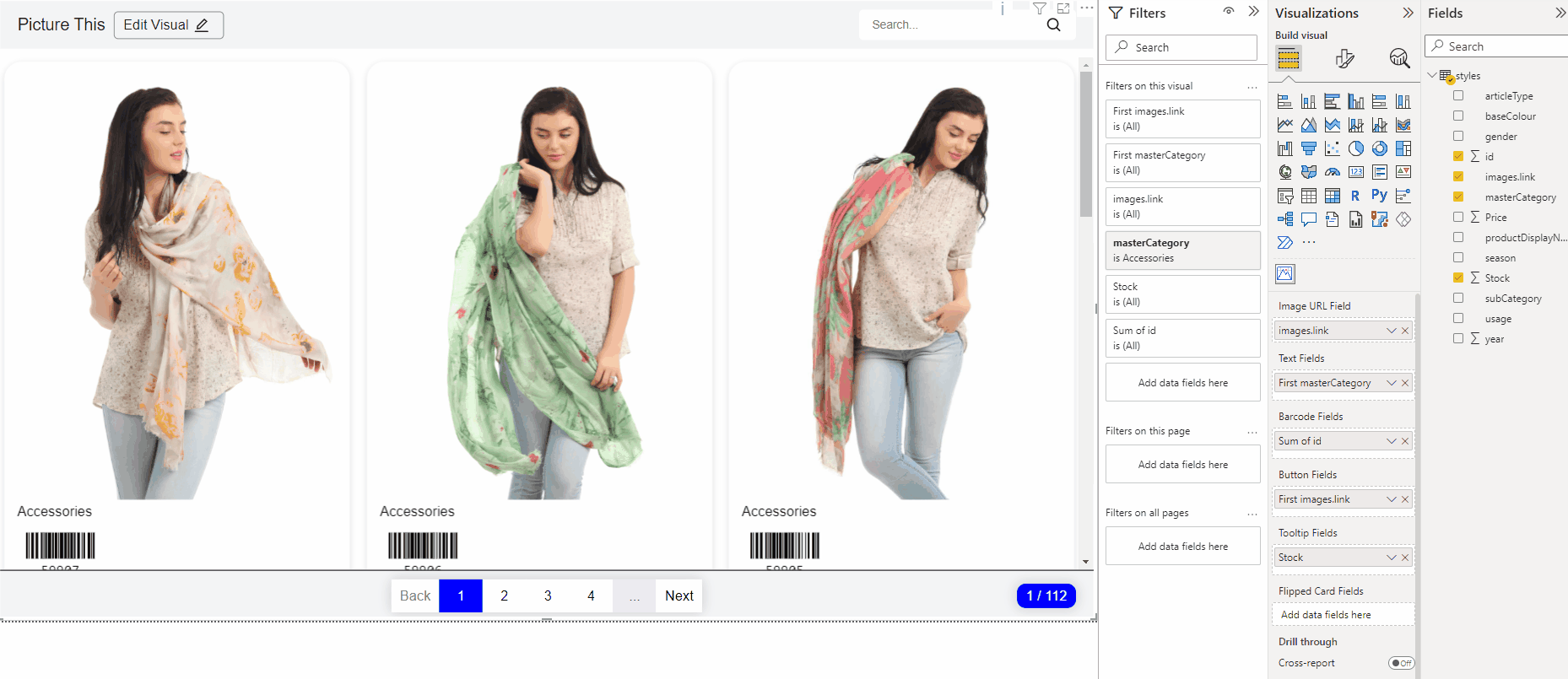
Fields
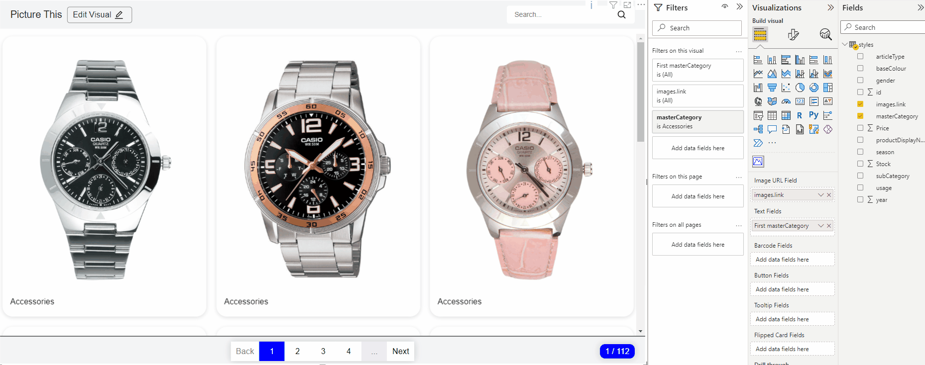
Would you like to present labels on the cards? Drag a text field to the Text Field.
Would you like to present labels on the cards? Drag a text field to the Text Field.
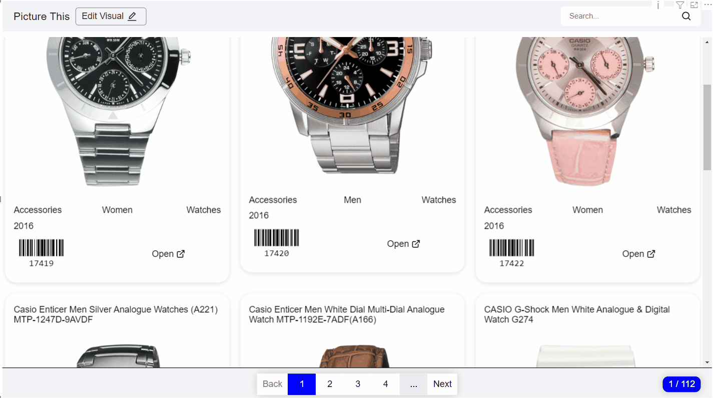
It is also possible to present barcodes on your card. Do you have a column that needs to be converted to a barcode? Drag the column to the barcode field.
Do you have a column of urls? Then use the button field to convert the url to a clickable button
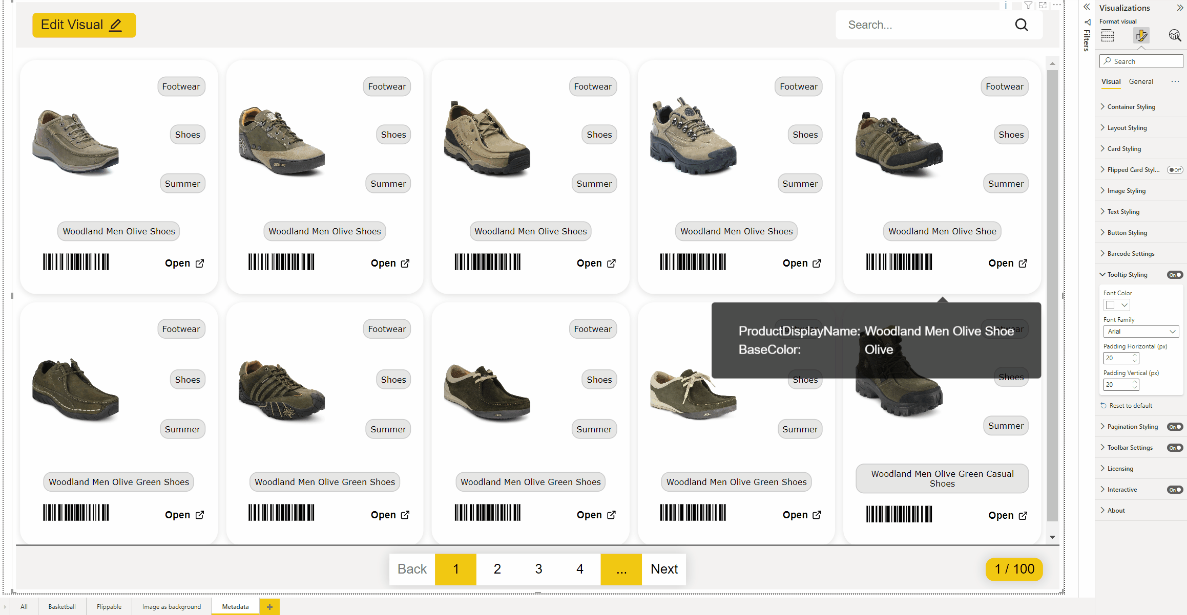
Want to display data when you hover over a map? Then use the tooltip field. Drag your column of data into the Tooltip field.
Want to present more fields on your map but don’t have enough space anymore? Then use flippable cards. This allows you to put data on the back of the card.
Styling
Now that the fields have been added, the cards probably still need to be styled. You can style the cards via the edit button at the top left of the screen in editor mode.
A dialog now opens in which 3 tabs are available to style the map:

In the layout tab, you can define the grid of the card. First determine how many columns you want by clicking on the +.
Then drag the fields where you want them.
Do you want a field over several columns? Then click on the bottom right of the card to make the field bigger or smaller.

Fields may still need to be centred, we do this in the placement tab. Select the column you want to adjust and set the vertical or horizontal position. Click Apply to see the change.
Want to add a prefix or a suffix to a column? This can be done in the text tab.
Format pane
This section describes the configuration of your PictureThis visual. In the Format pane you can change a lot of settings.
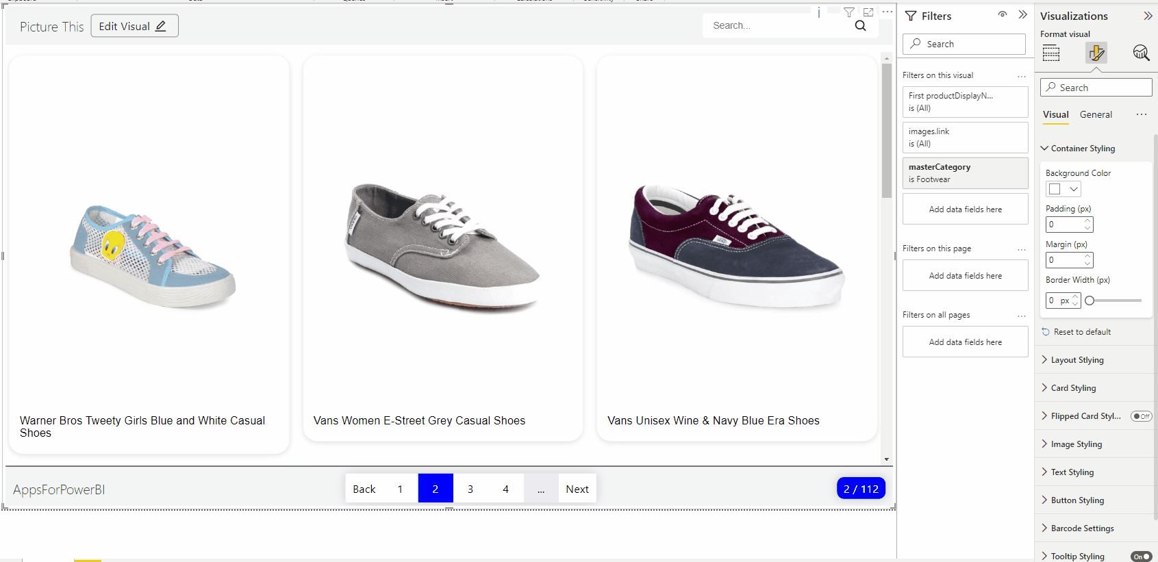
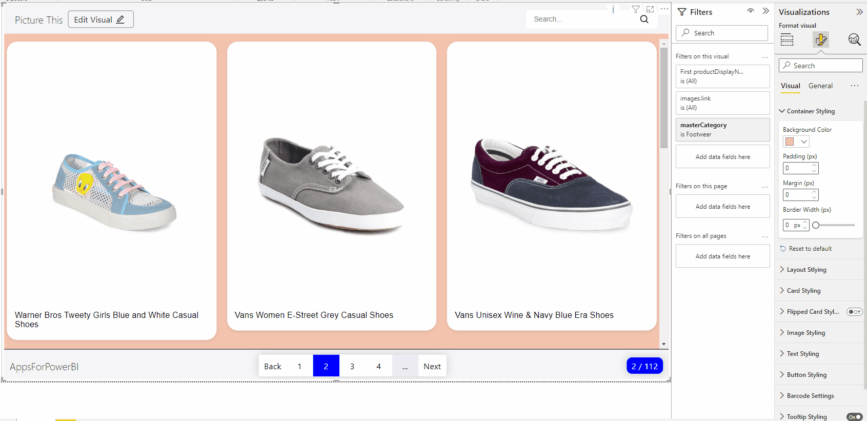
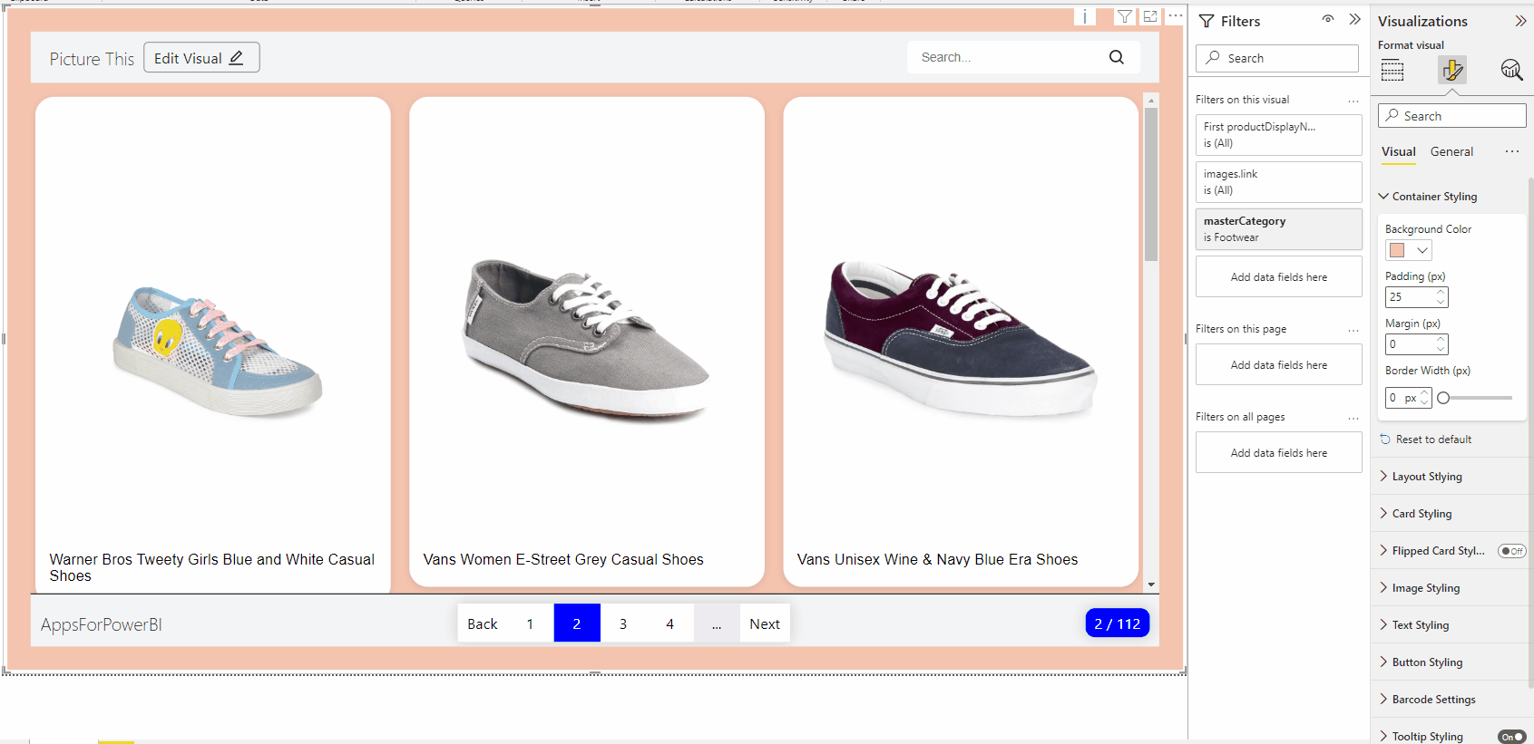
Container Styling
If you want to change the background of your visual, this is where you can do it. With the default PowerBI colour picker, you can choose the background colour to suit your needs.
If you want to add a bit more padding to your container, you can set it here in PX.
You can also change the margin of the container in PX
Layout styling
In the layout styling you can define the amount of column’s of your cards and set the gap between the cards in PX.
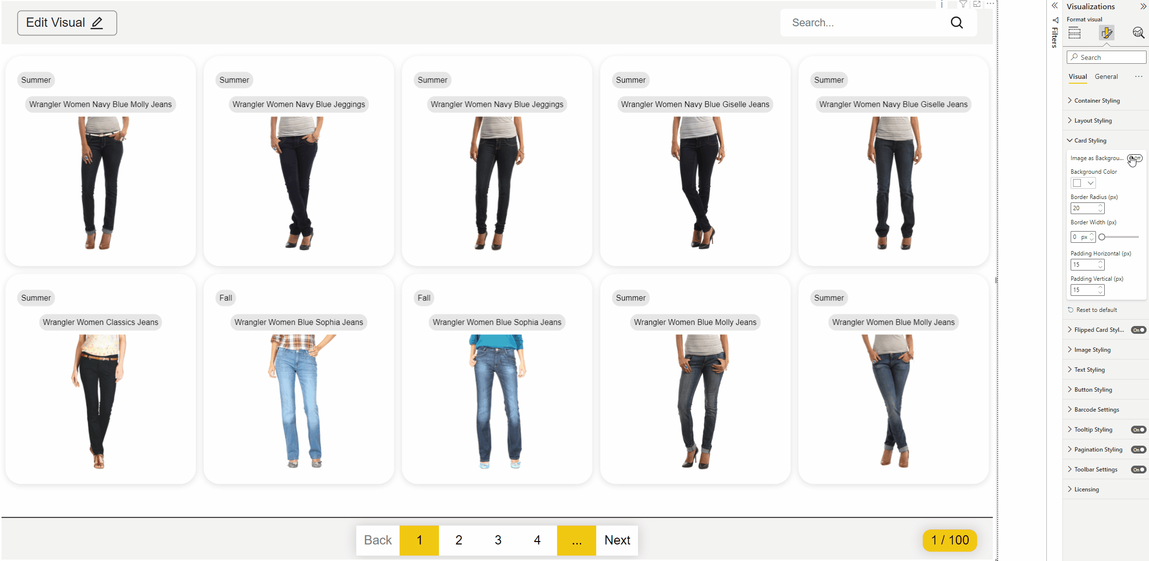
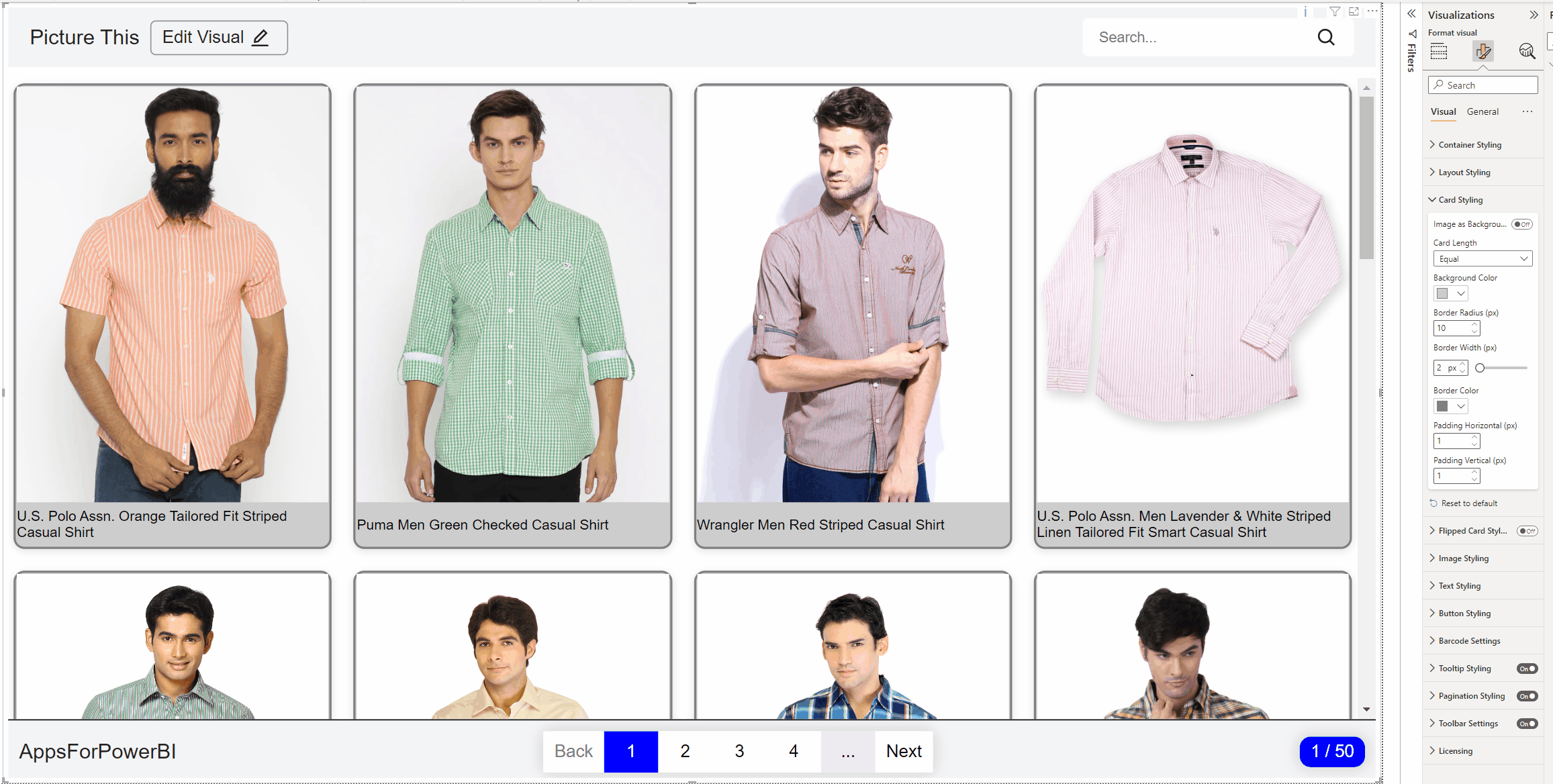
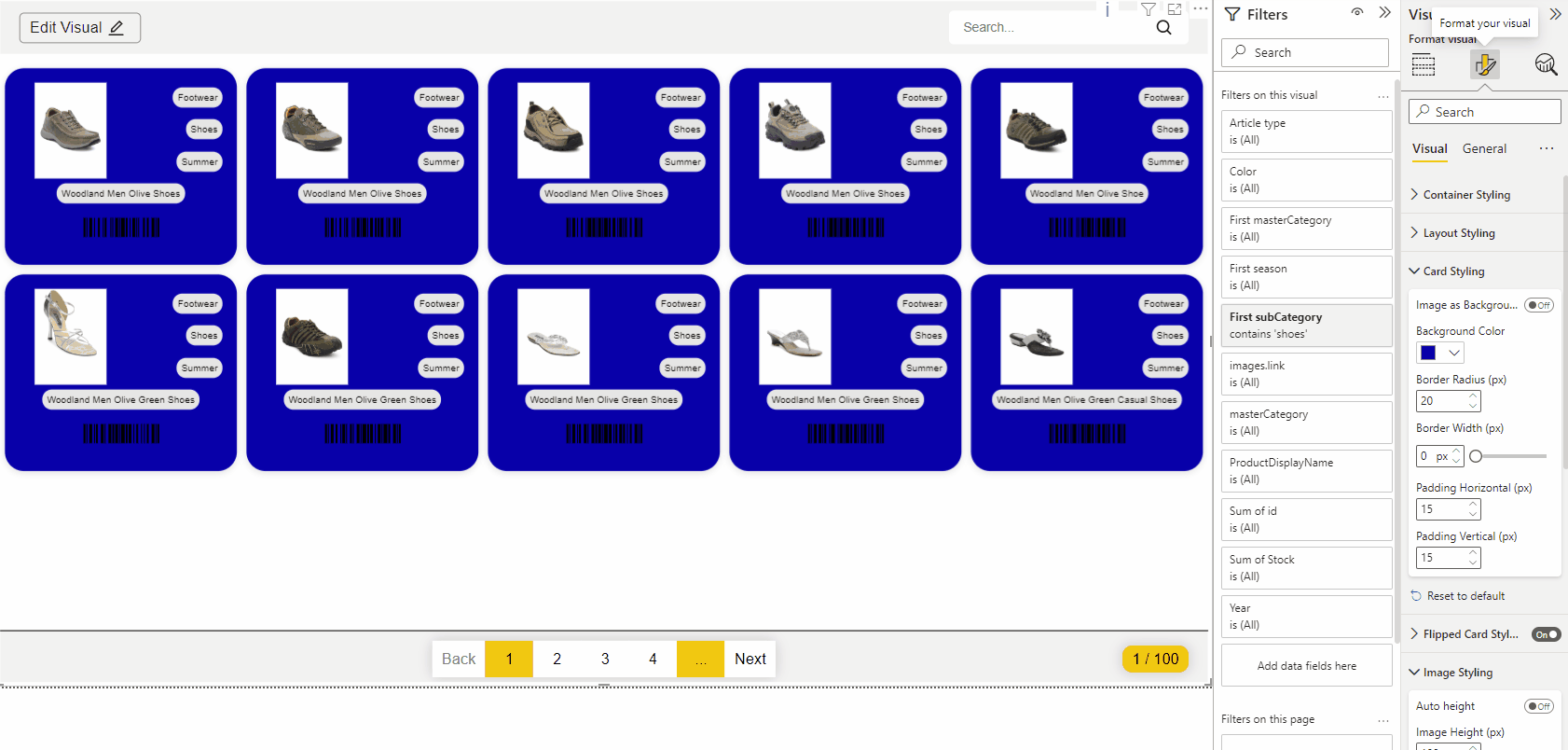
Card styling
It is possible to render your image as a background. Go to the Card Styling tab and click Image as Background. Now a new field will appear called Card Size. Choose to set the height of the card using the text fields or set the height of the card yourself. Do you choose this? Then enter the height of the card in PX
Do you have pictures wihout background? With the default PowerBI colour picker, you can choose the background colour to suit your needs.
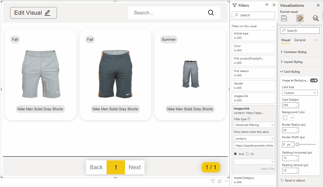
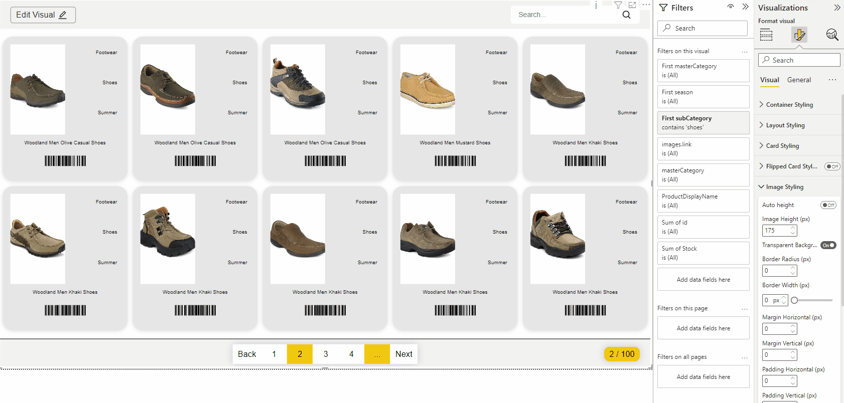
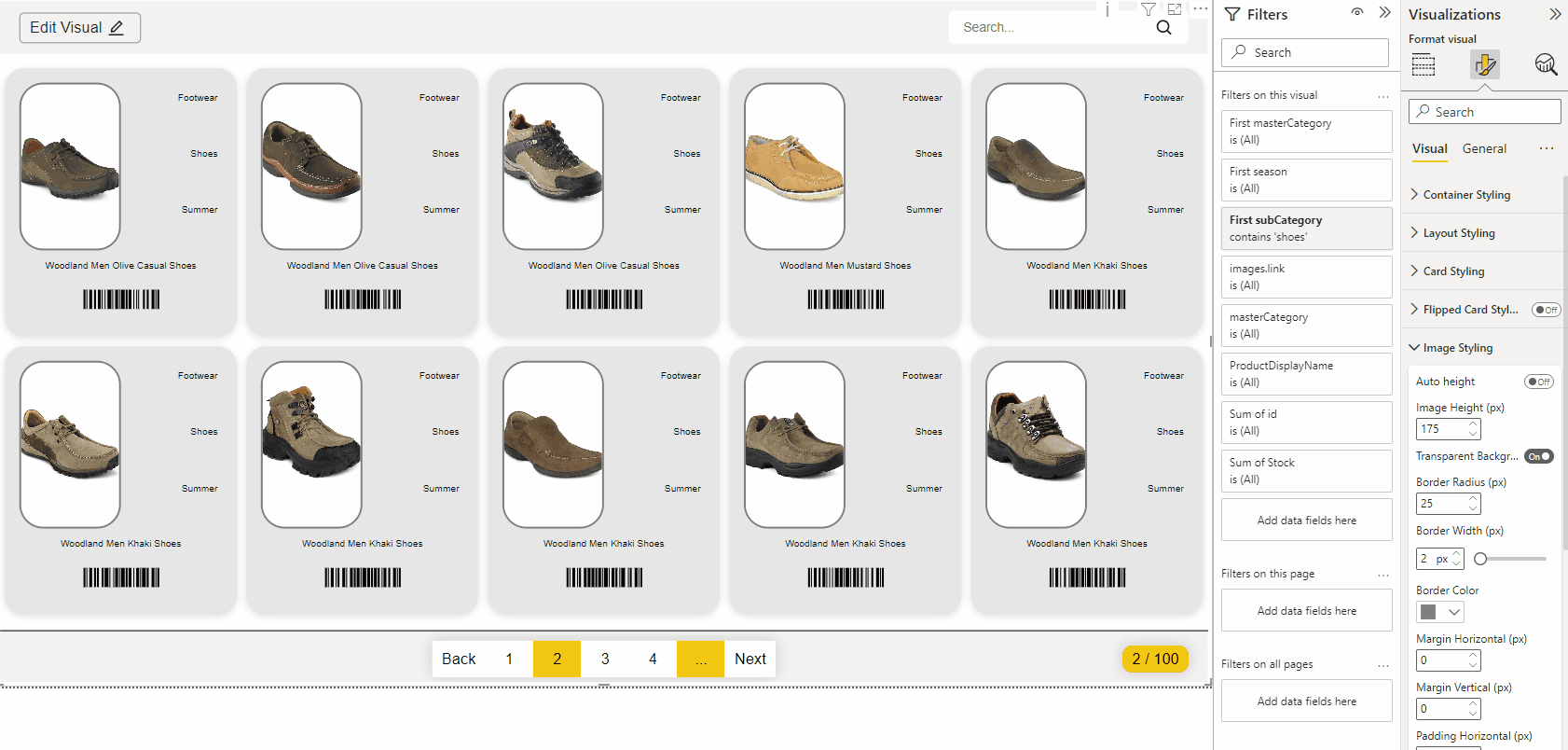
Do you want to change the border radius? Here you can set the border radius in PX.
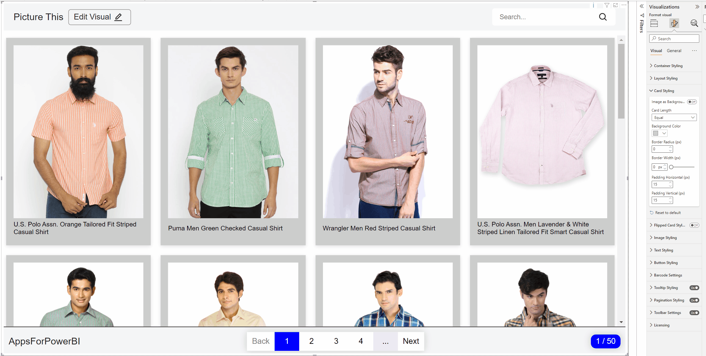
Here you can change the border with in PX, when the border is bigger then 1PX, you can also change the color of the border.

Must your card have some padding? changes the vertical and horizontal padding here.
Flipped card styling
Want to put more data on your card but don’t have enough space on the card? Use flippable cards! You can now use the back of the card to present more data.
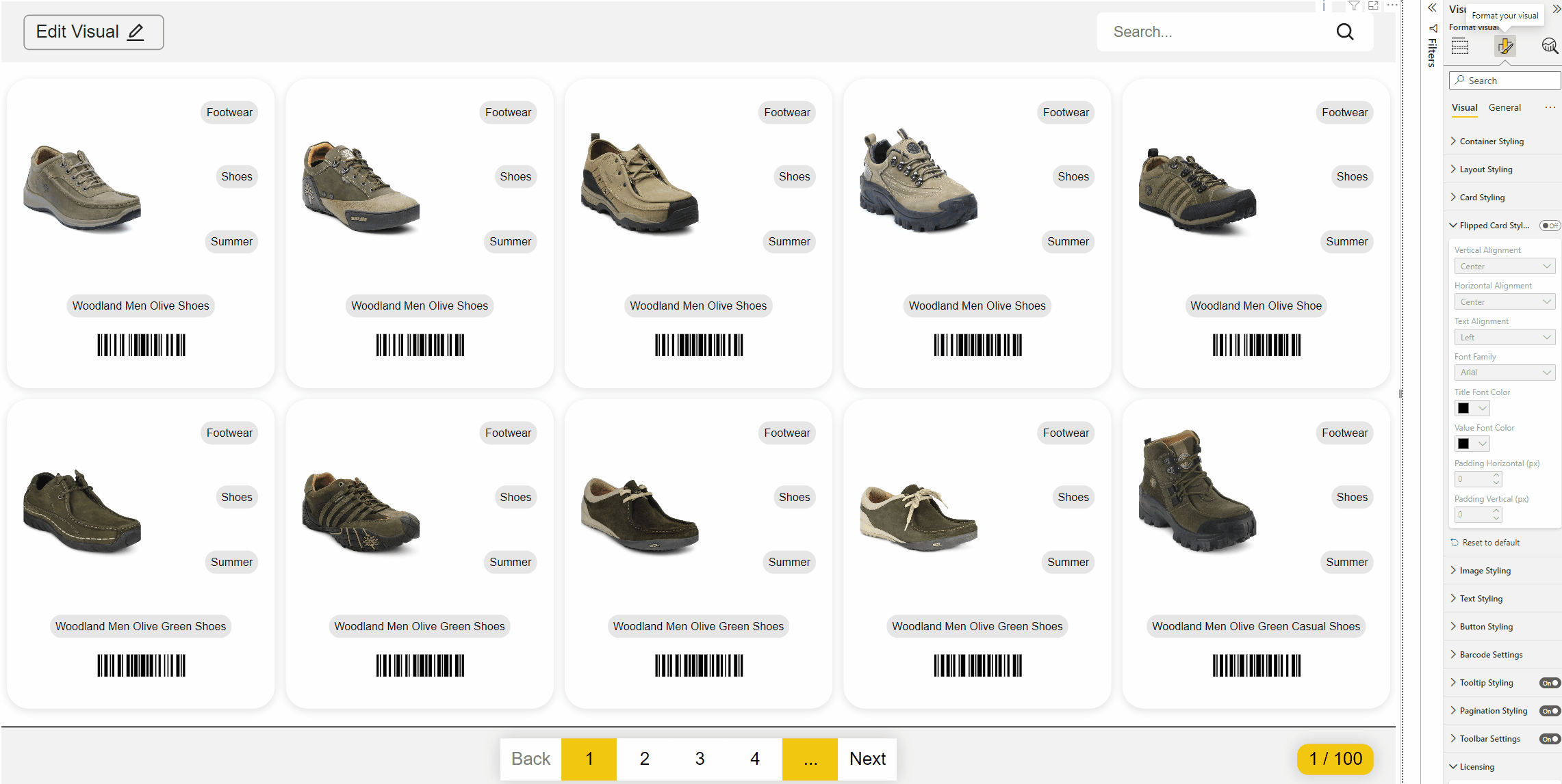
Want to change the vertical position? Adjust the vertical alignment here.


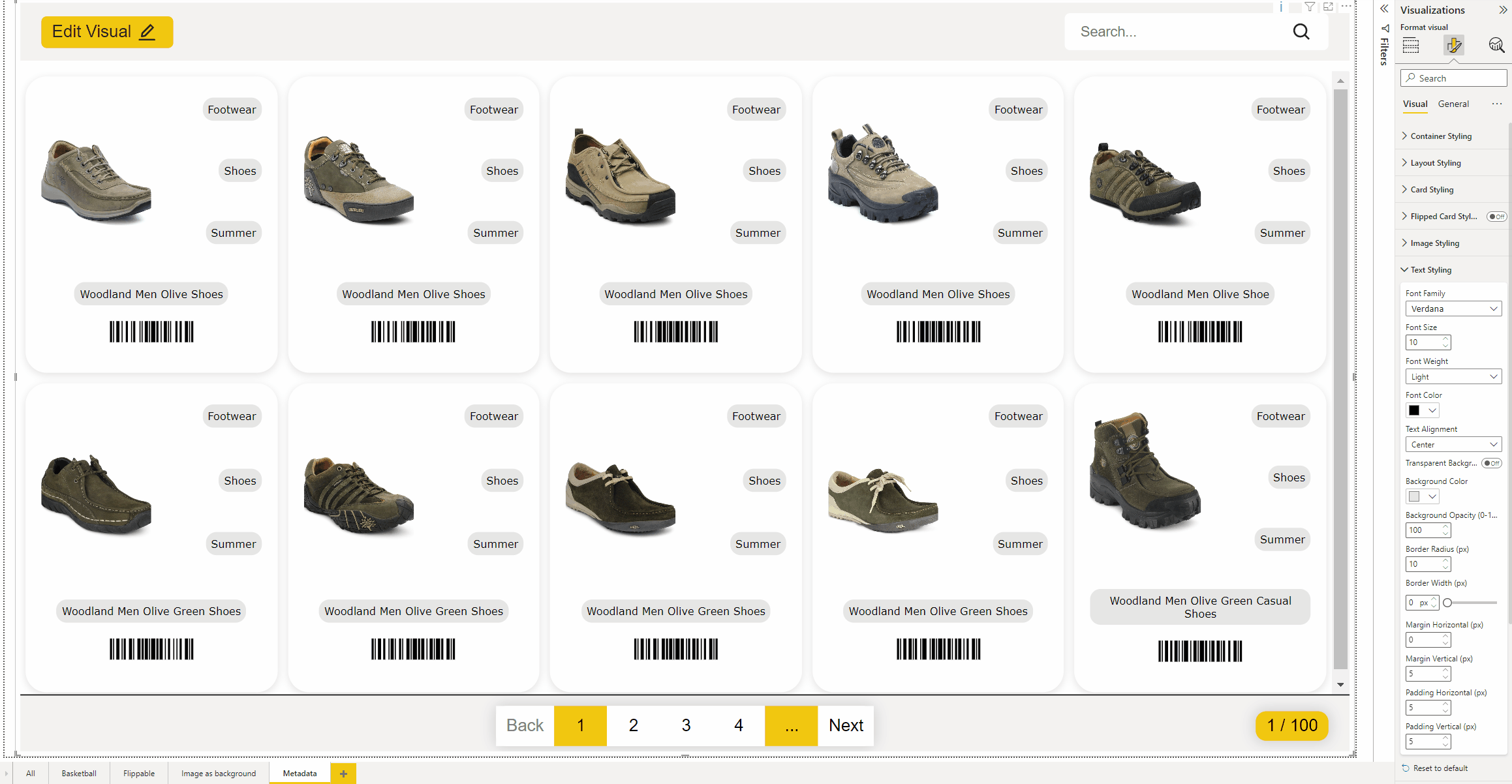
When the alignment is set properly, you also have the option to align the texts. In Text alignment, choose Left, Center or Right
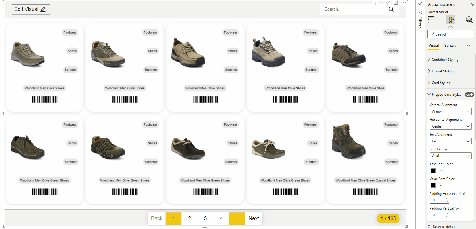
Want to use a different font family, or change the title or value? Choose the font family you want to use and change the color of the Title or Value to the colour of your choice.

Image styling
The image styling tab has two different options, depending on the switch image as background in the Card styling tab. Both options are explained below.
Image as background is turend on
There are several ways to determine the size of the image:
Auto: the image grabs the orignal size.
Contain: the image keeps its aspect ratio, but is resized to fit within the given card
Cover: the image keeps its aspect ratio and fills the given dimension. The image will be clipped to fit
Custom: determine the size of the image yourself with the newly available field “Image height”
When using Image as background, it is not possible to determine the position of the image in the edit pane. Under Image styling, you have the option to determine the position of the image as background

It is also possible to choose another background colour when using Image as background. To make sure the image doesn’t blend in with the colour, you can change the opacity.
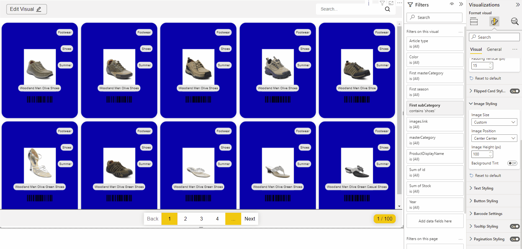
Image as background is turend off
When you choose to set auto height to on, the image will automatically size itself according to the available space in the map. If you turn it off there will be a extra field where you can fill in the image height.
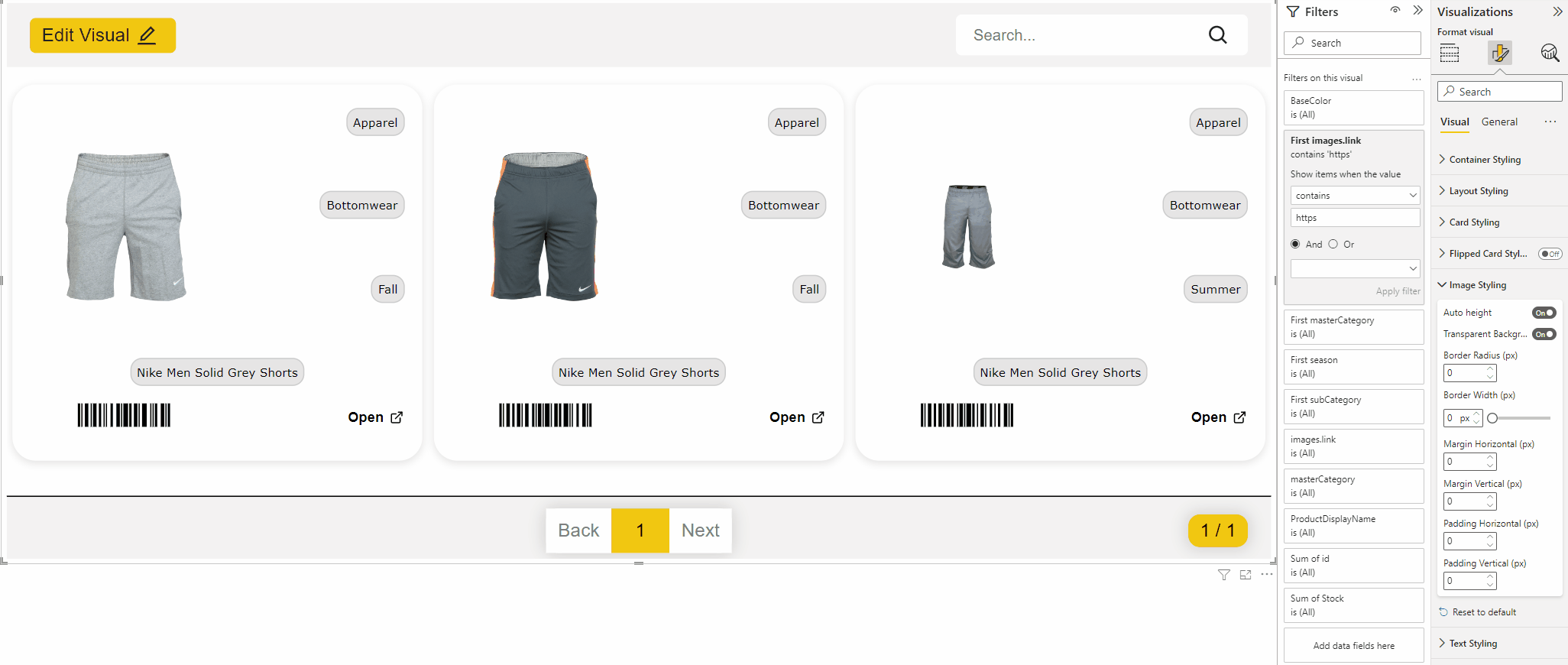
If your image has a transpart background you can turn this option on. After that you have the possibility to change the background color of the image.
With Border Radius you can give the image rounded corners. You will only see this when the background of the image is different from the background of the card, or if you have entered a border width
Here you can set the border width, if the border is bigger than 1 px there will be another field available to set the border color.

You can set horizontal and vertical margins for the image.
You can set horizontal and vertical padding for the image

Text styling
Do you want to change the font of your text fields in the cards? Use this option to change the font.
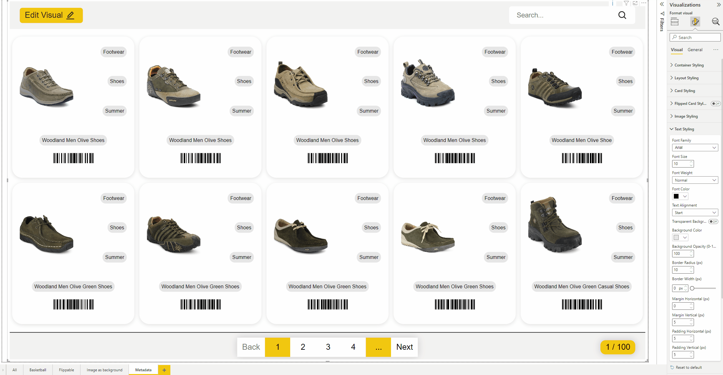
Make the text bigger or smaller? You can determine the size of the font.

Do you want to have a other Font weight?
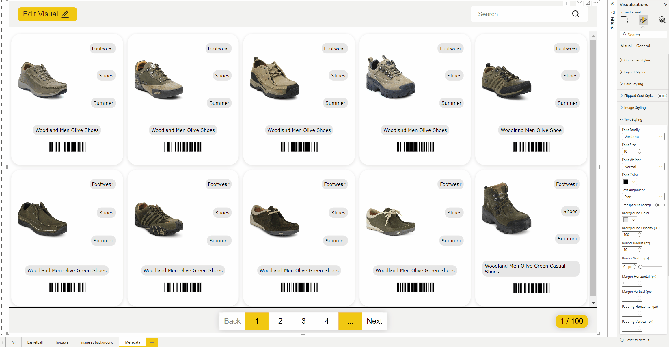
Here you can change the Font color with the default color picker from Power BI
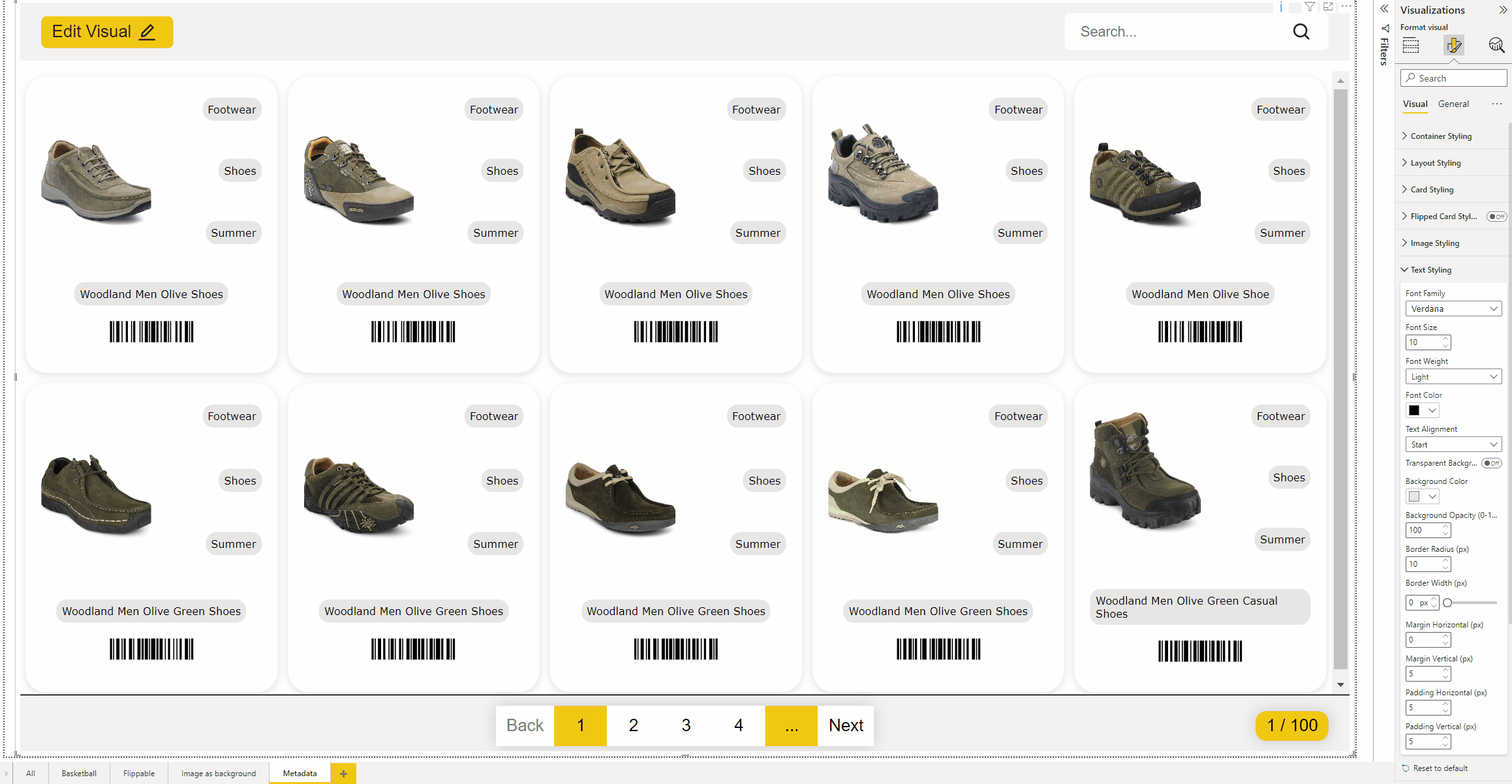
You can turn on and off the Transparent background, if you turn it off it is possible to change the background color of the text. When you have chosen a background color it is also possible to change the Opacity, 100 means no Opacity, and 0 is full transparency.

When you have set a border you can also set the border radius.

When you set the border with it is also possible to change the color of the border.

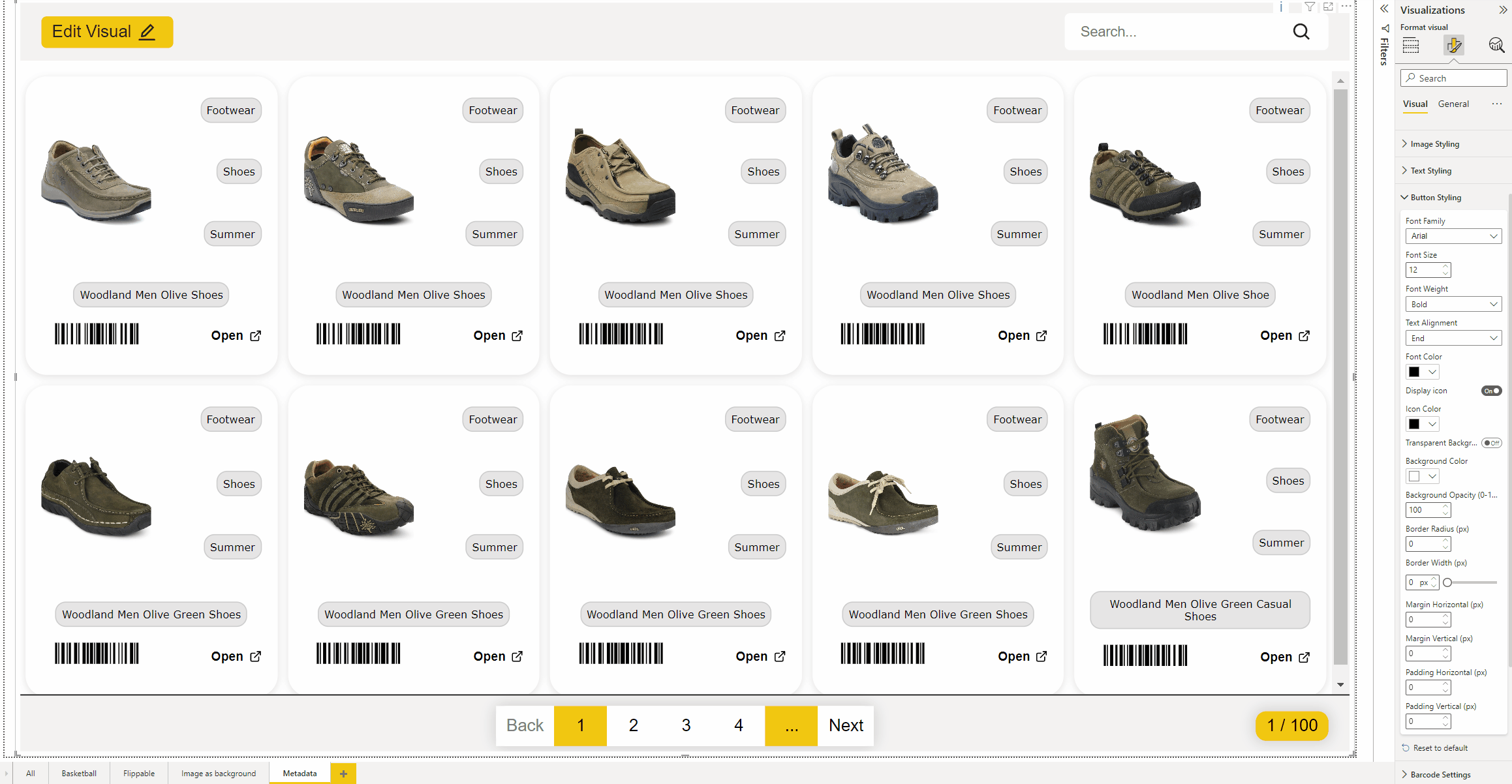
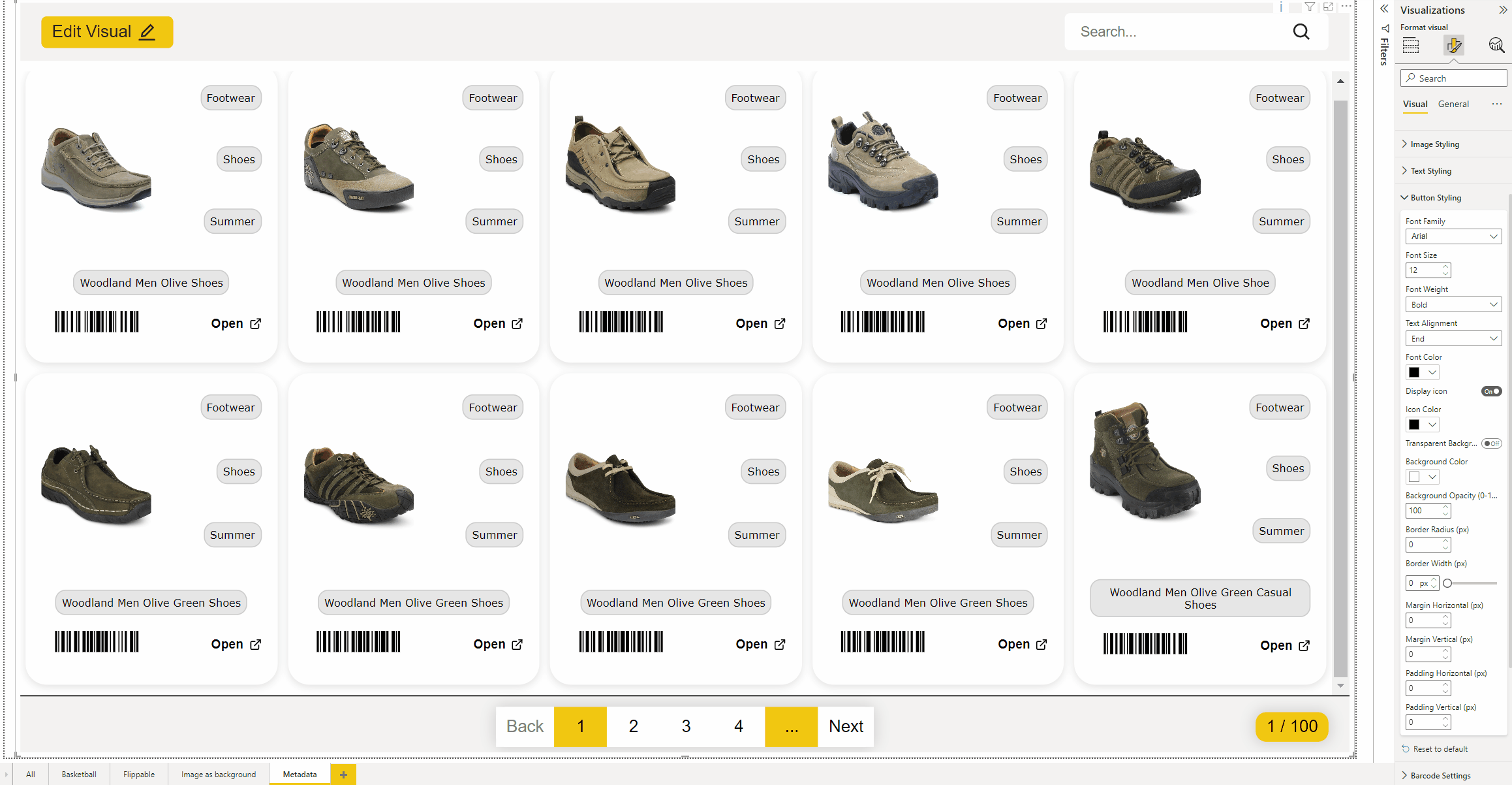
Button styling
You can also style the text of the button however you want, see also the font styling in the Text styling chapter.
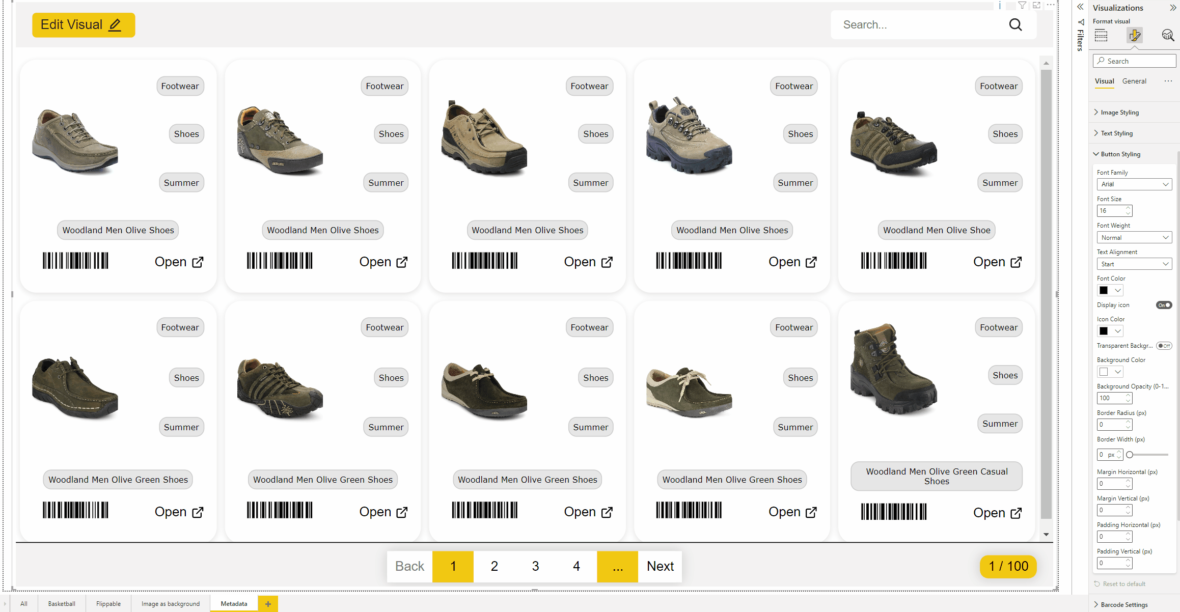
Do you not want to show the icon in the button? Turn this off.
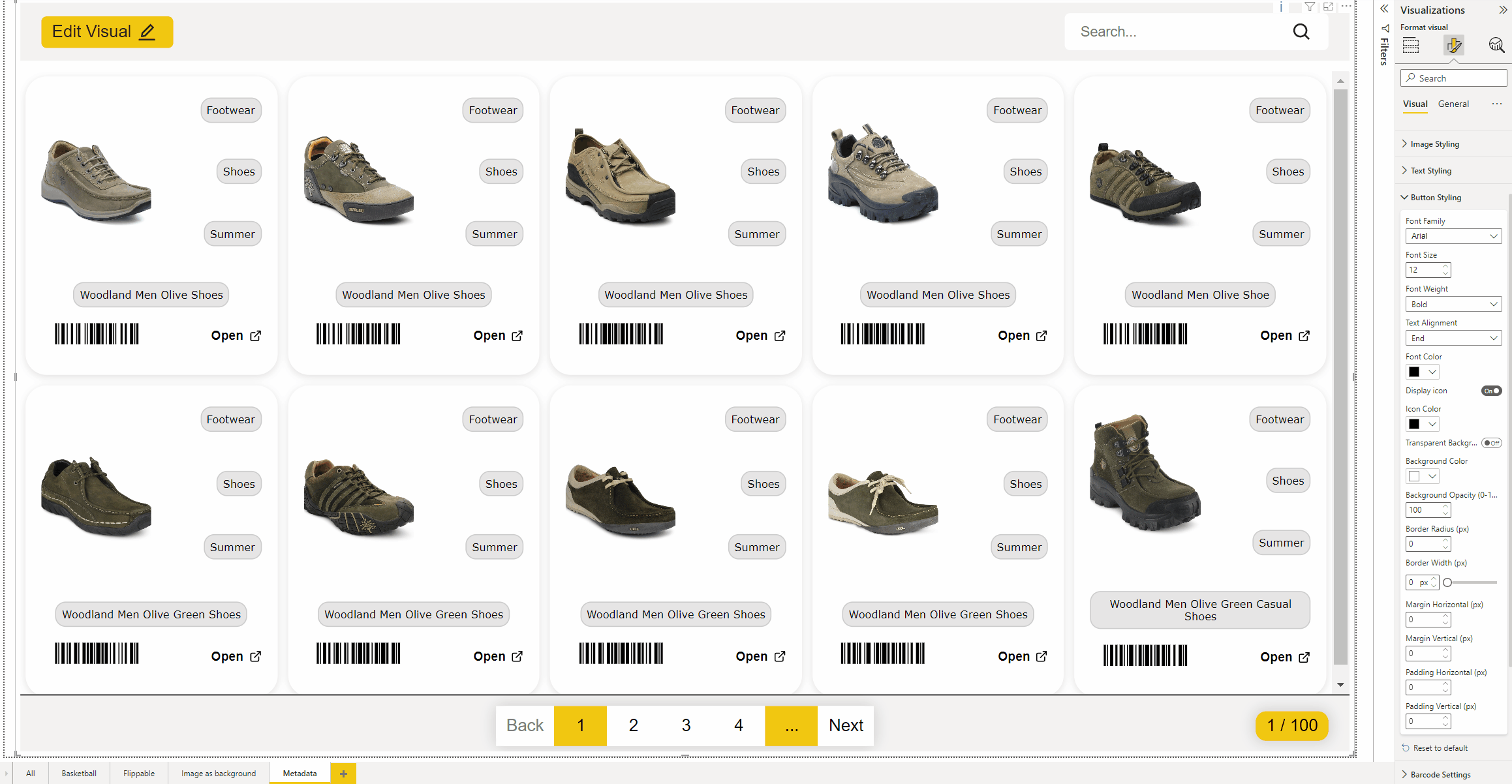
Have you turn on the Icon? Now you can change the Icon color.
It is also possibe to change the background from the button, it works the same as Text styling, see also this chapter.
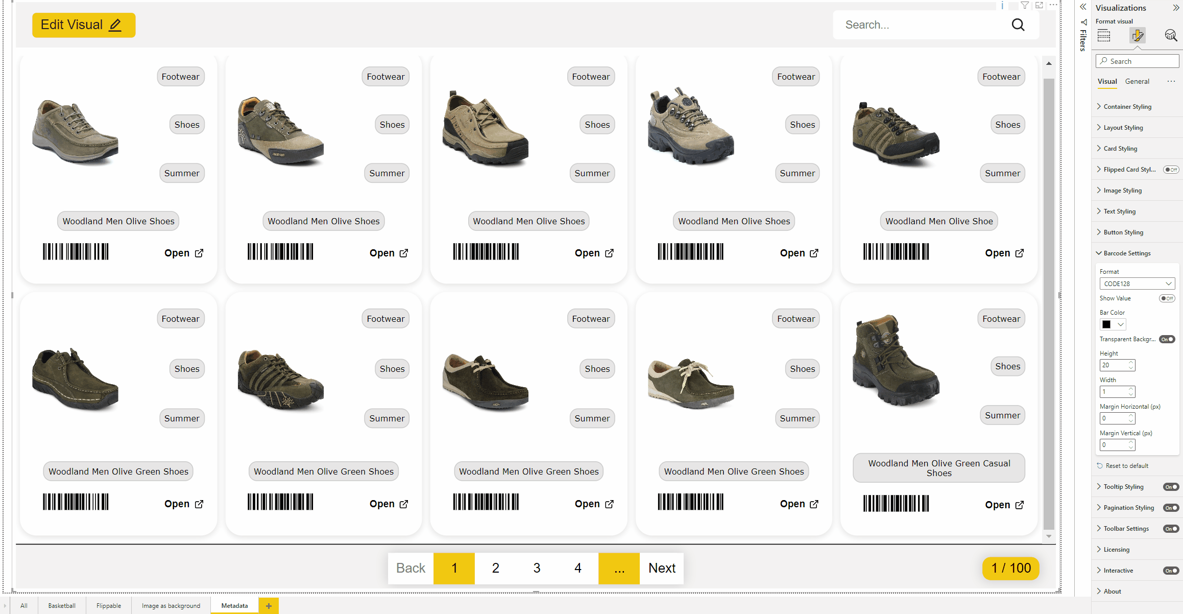
Barcode settings
When you use Barcode you have the possibility to change the format of the barcode.
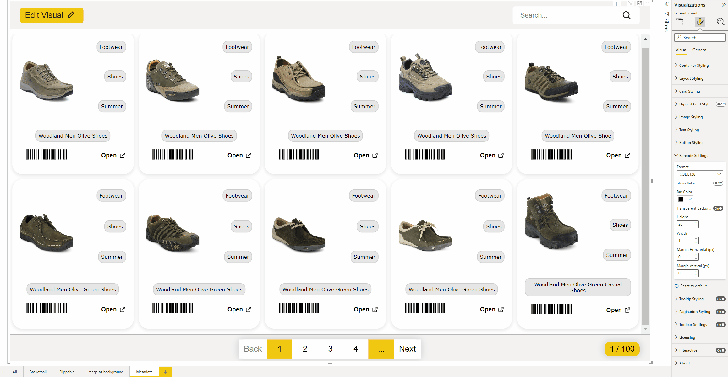
Do you want to show the value of the barcode below the barocode? Use this toggle.

Want to have a other barcode color? Use the default color picker to choose your color.

Here you can decide if you want to use a background.
Is the barcode to small or large? You can set here the height of the barcode.
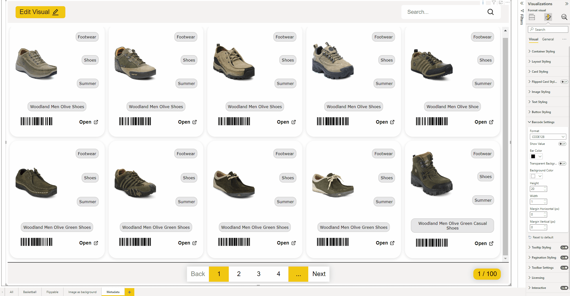
And of course you can also determine the width yourself
Tooltip styling
If you turn on the tooltip, you can set the color of the tooltip
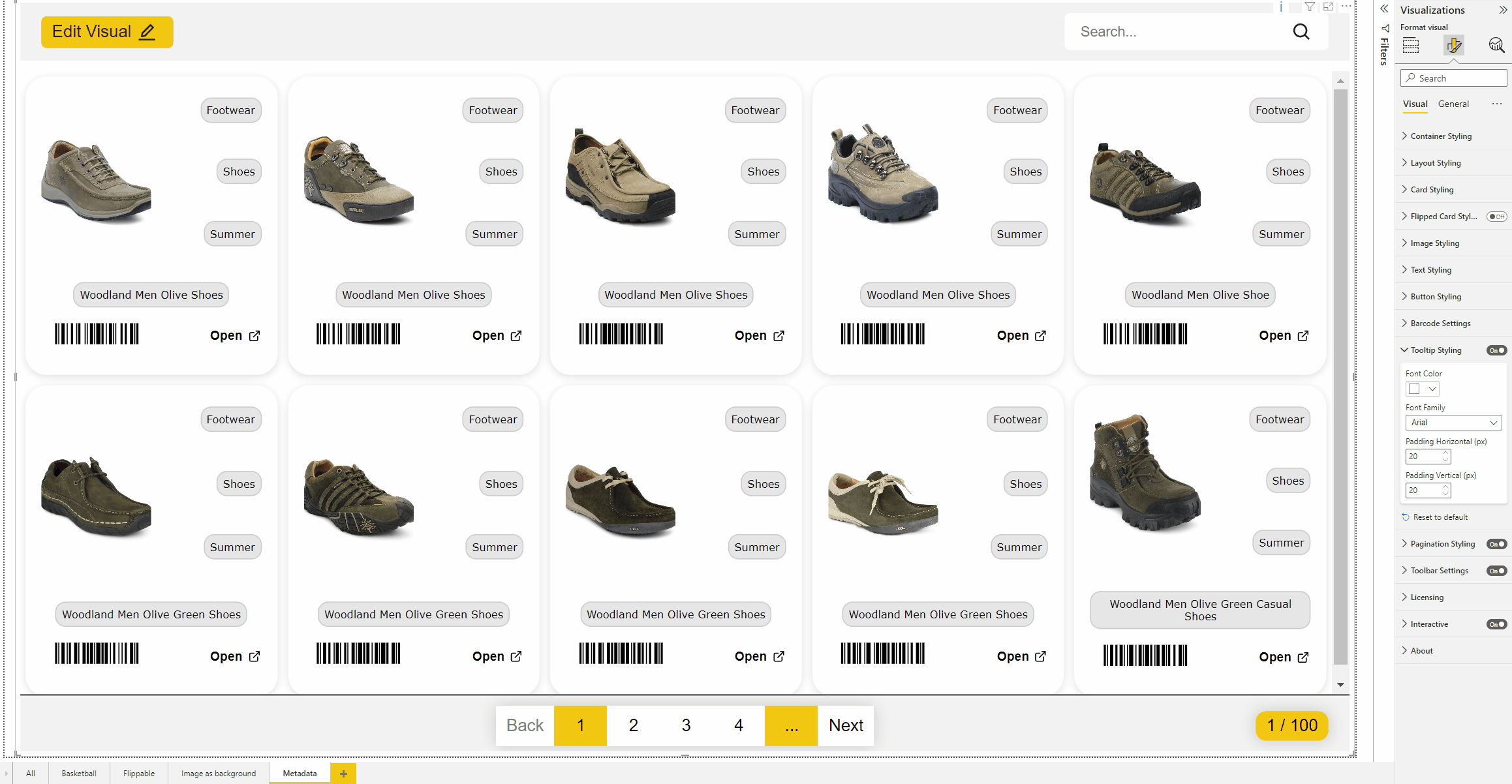
Here you can set the Font family of your choice

In the Padding horizontal and vertical you can set the padding for the tooltip text.
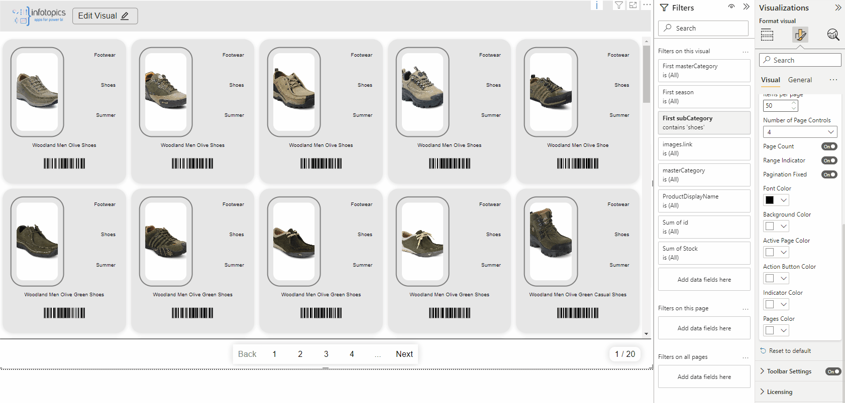
Pagination styling
If you have a large dataset we recommend turning on the pagination, in the field items per page you can decide how many pictures there must be visible per page.
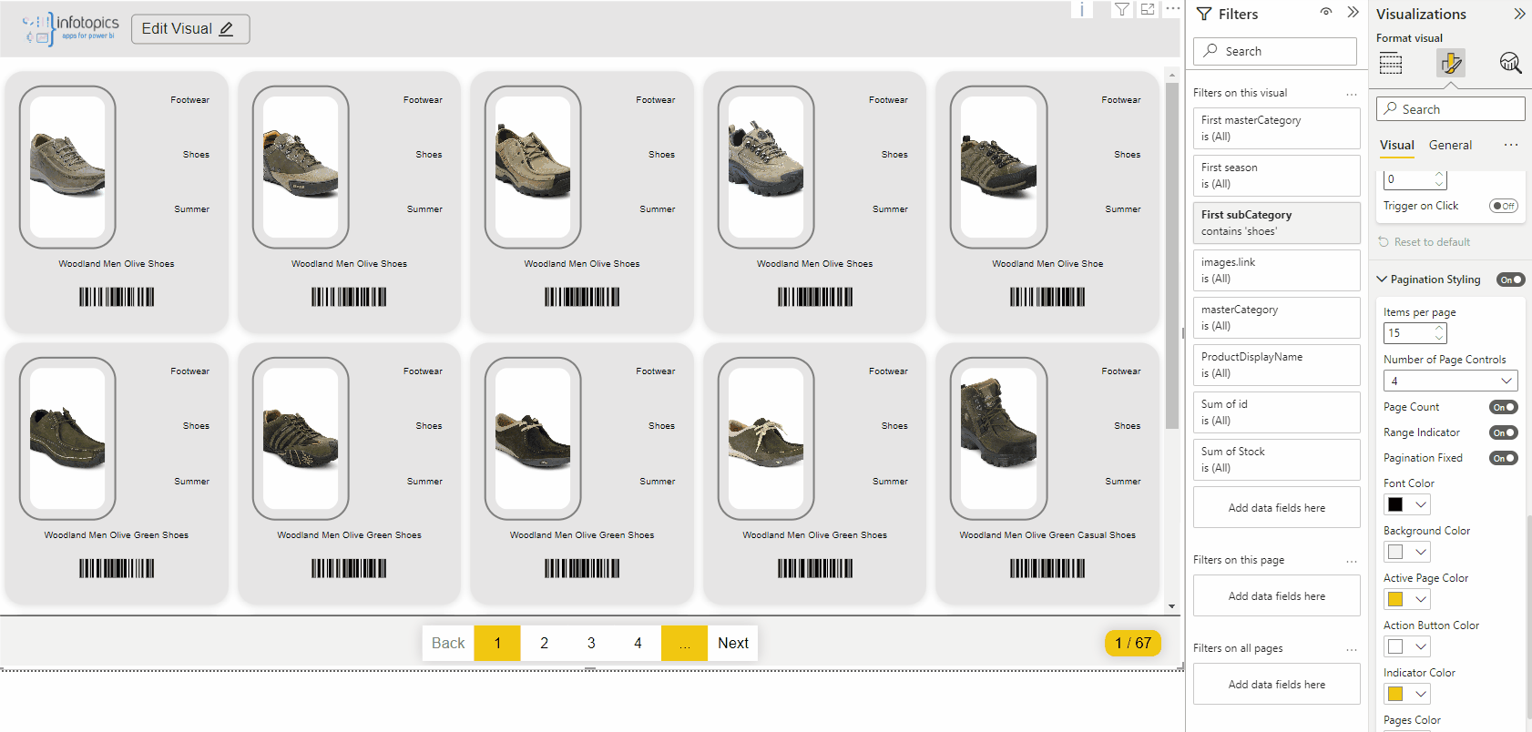
You can decide if you want to have 1, 4, 6 or 8 numbers in the pagination.

In the footer of the visual you see the amount of pages, if you don’t want to see this, turn this option off.
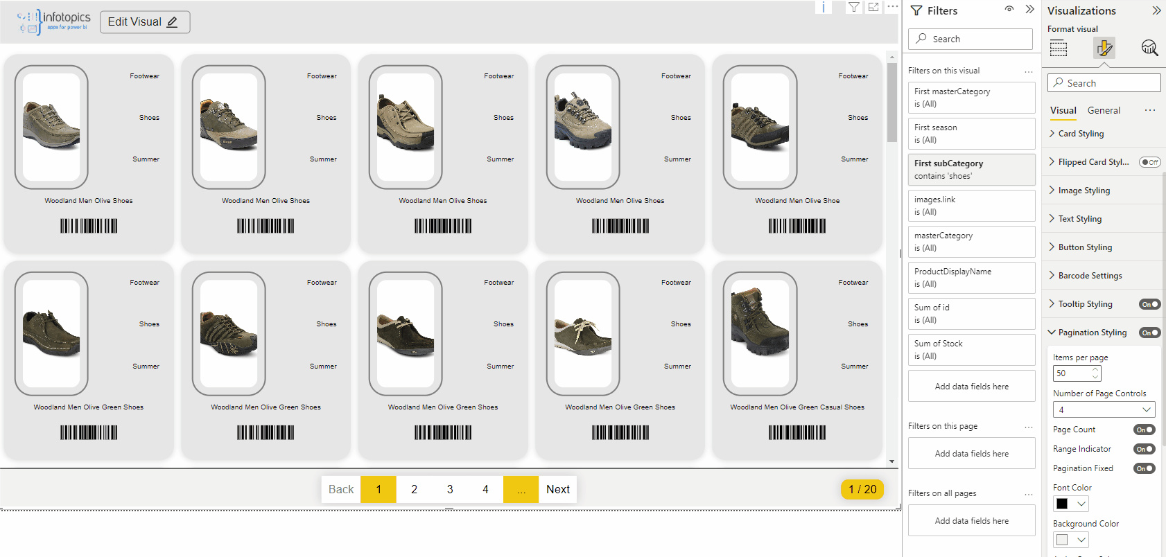
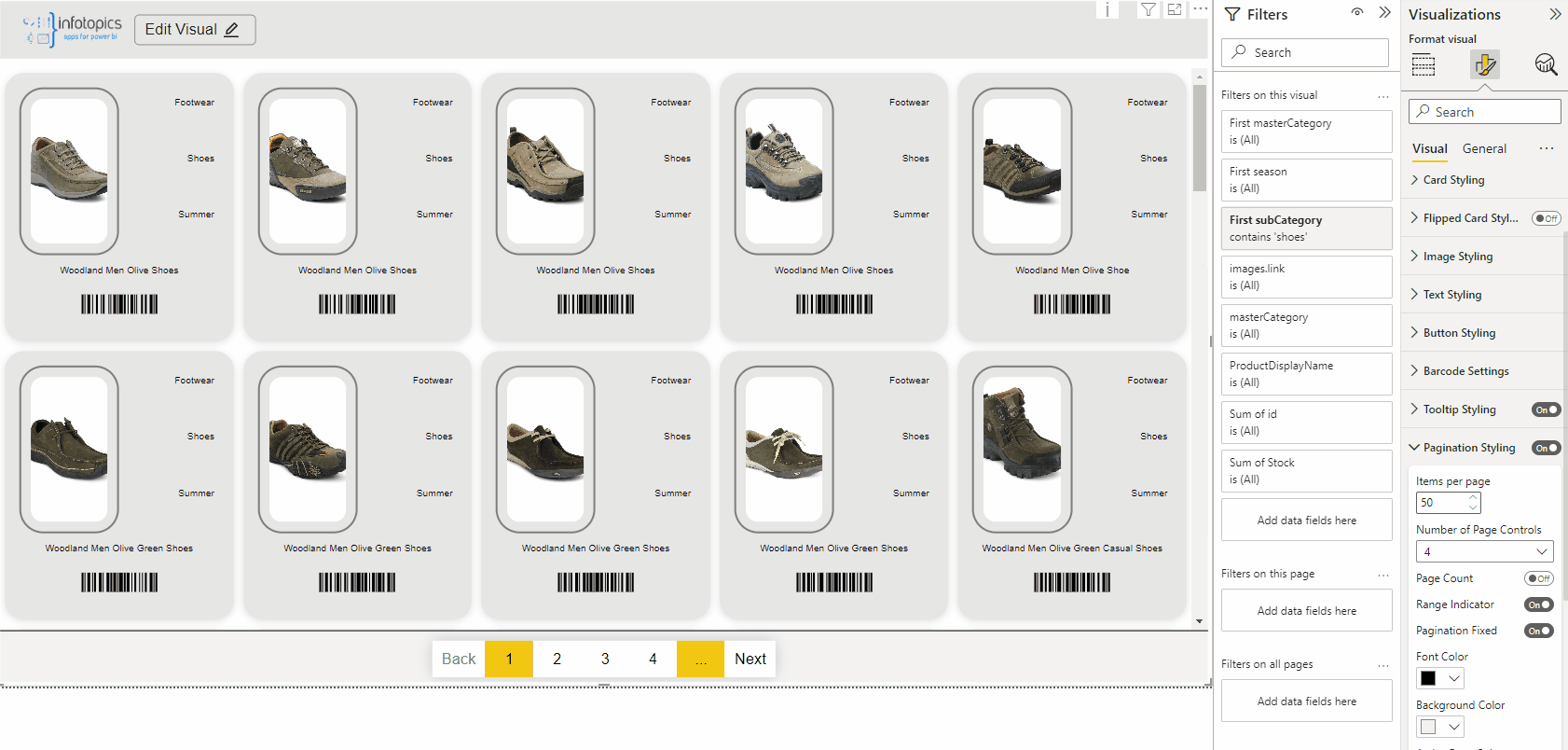
If you only want to show the footer at the bottom of the list, turn paginationthe fixed off. If you want to show the footer always, turn this function on.
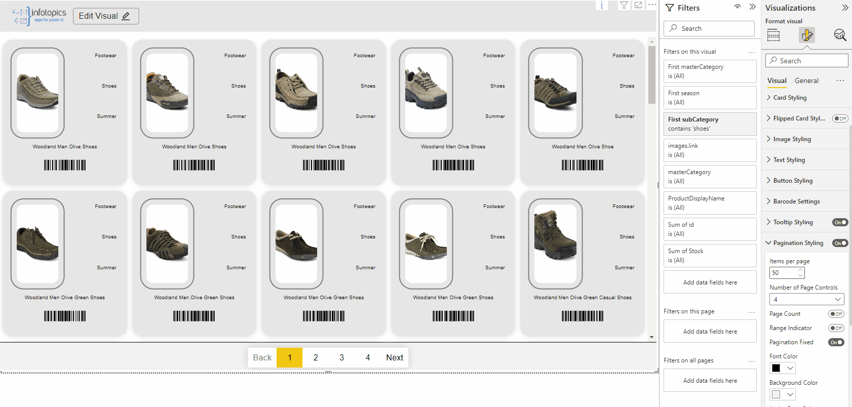
You can customize your footer how you want, you have the possibilty possibility to change the colors of the font, background, active page, action button and more!
Toolbar settings
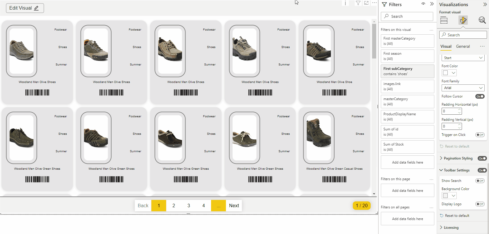
In the header on the right side, you see a search bar, if you would like to disable that, turn off the switch
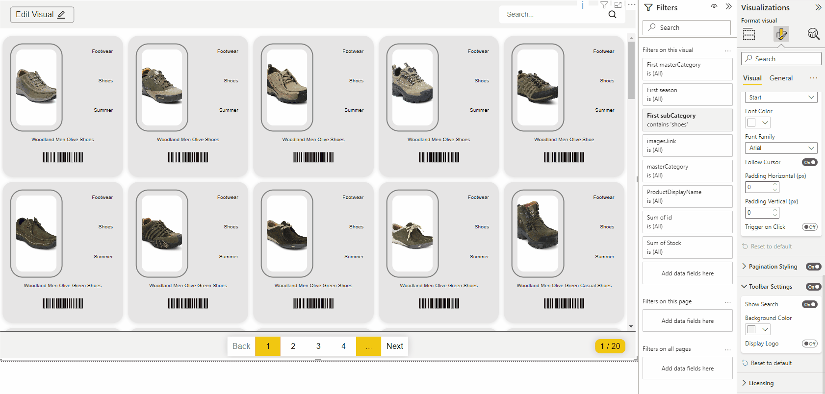
To make sure your visual is used entirely in the company colors, you can also customize the color of the header.
Do you have a logo or text that you would like to show in the header? Turn on this option. In the logo field type in a text or put in a url. If your input is a url of the image, please turn on Image URL Logo and the logo will be visible in the header.
About
Here, you will find which version of PictureThis you are using and the Infotopics | Apps for Power BI website link.
We love to make solutions and help Power BI users to do things more efficiently. If you have feedback, ideas, questions or need support, please share them with us! Also, don’t forget to follow us on social media for our latest news and updates.